
Lost in Space: The UX Problems Plaguing Starfield
How Inventory Chaos and Clunky Menus Hold Back an Otherwise Stellar Experience.

I’ve been playing Starfield—Bethesda Game Studio’s latest massive single-player RPG—for over 20 hours now, and like many reviewers, have struggled at times with the game's user interface. Dan Stapleton at IGN wrote in his review — "Starfield is a game that is roughly 30% inventory management… and yet it is shockingly bad at that task.” and as a life-long gamer, and designer with nearly two decades working on user experience and user interfaces, I’m inclined to agree. There is a fine line between “fun friction” and annoyance, and I don’t think Starfield treads it well.
Before I begin this critique, I want to call out just how incredible the accomplishment of making a game like Starfield is. It’s clearly the collection of hundreds of people working thousands of hours for years, and while it may have relatively obvious flaws in its UX/UI upon its release, these issues aren’t always obvious during development, or they get deprioritized to focus on other things. However, for a game that asks you to engage with its menu system so often, it’s surprising just how difficult it is to parse, navigate, and accomplish tasks as a user. So I wanted to see if I could further diagnose the problems plaguing Starfield’s menu system.
Worst of both worlds
A common challenge for many multi-platform games developers to solve is their approach to interface. Users on controllers require far different interface and affordances than those with a mouse and keyboard. Most games don’t build adaptive interfaces that change depending on input, like an app designed for touch, or mouse, because it would be a fairly large task. But to truly optimize the user experience, such effort would be necessary. What Starfield has done, then, is create an interface that feels native to neither experience.
Starfield’s inventory screen is a perfect example here. A comfortably-padded, single-column view, grouped into categories, then replicated again inside each category.

Scrolling lists is inefficient for mouse/keyboard, and too many clicks/flicks for controllers.
Mouse users have far more pointing accuracy with their inputs, and better cursor dexterity (the ability to move your mouse from one end of the screen to another quickly and accurately). Years of designing interfaces on desktop agree that with this type of input, users can navigate more dense interfaces, and can also navigate multiple columns, and grids of information with less issues.
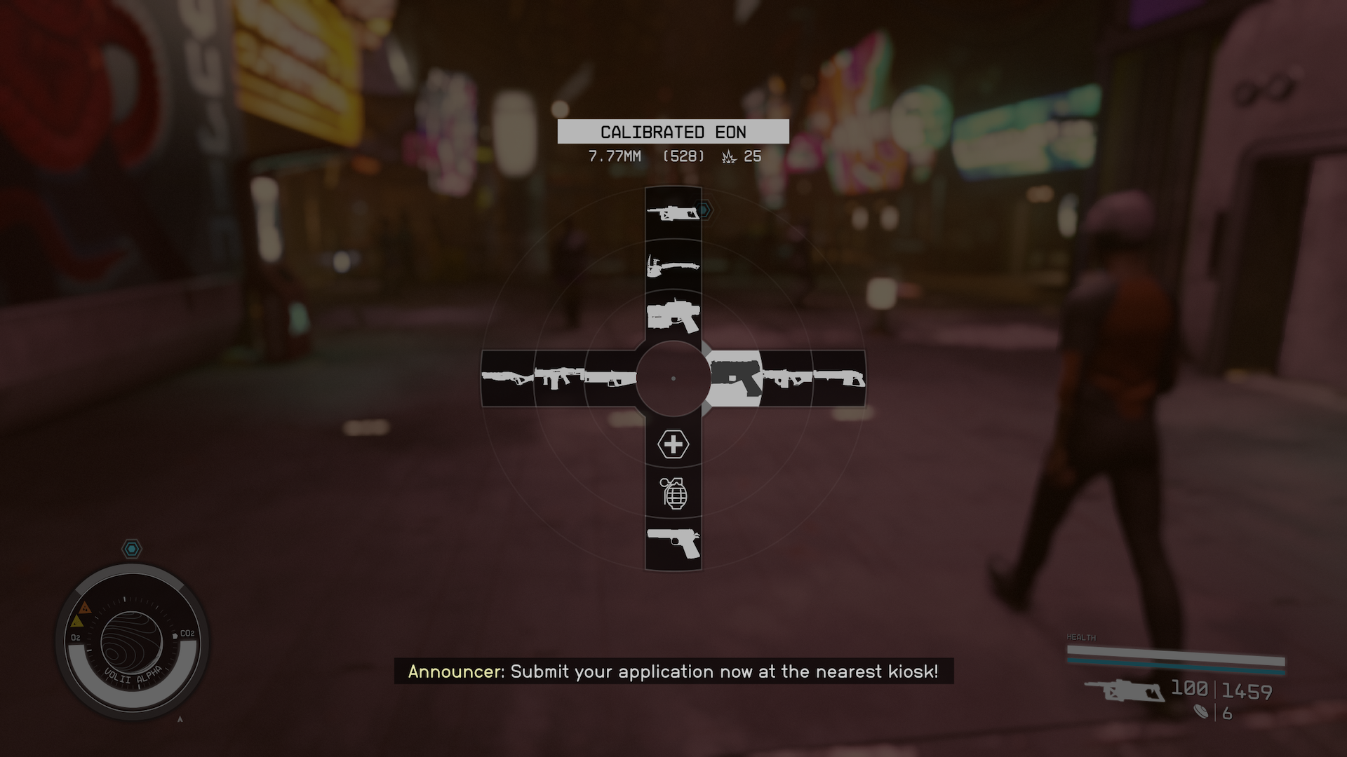
Controller users, however, have directional accuracy in their joysticks, and d-pads, but lack the speed or precision to navigate multiple columns or large grids quickly. They also sit farther away from their displays, suggesting larger fonts and spacing would be necessary. To navigate through the inventory groups, it’s several gestures or presses for the user to reach the bottom of each list, which can be potentially dozens of items long. An example of a more joystick-friendly interface is the radial menu, the choice made for the main pause/character screen in Starfield. Where a user gestures in a specific direction, and selects into a group without being asked to navigate past options they may not deem relevant.
The single column, category grouped interface for inventory management is thus slower and more tedious to navigate. It’s the worst of both worlds for keyboard/mouse and controller users. A more comprehensive solution would have seen a different design for mouse/keyboard and controller users.
Waste management
The concept of encumbrance — the state in which your user is carrying more items than the game wants to limit the user to, is too difficult for users to triage. While it’s true that encumbrance has been improved from past Bethesda games (user’s characters use to slow to an unplayable-crawl in games like Skyrim and Fallout), tools that are there to manage encumbrance, like skills, companions, and ship cargo, but the game makes most of them tedious, and rarely fun to engage with.
When designing for “errors” in UX, there are three principles to follow:
Visibility: how the error message presents itself to users.
Communication: what the error message conveys about the problem and possible solutions.
Efficiency: how the error message aids the user in overcoming the issue
Visibility could be improved, A fading, momentary on-screen message for the user, and companion barks isn’t enough in my opinion. If the encumbrance system warned the user when they were nearly encumbered — maybe they don’t pick up that extra nicknack they don’t need, and the inventory system relies on a single visual signifier—a fractional number—to communicate encumbrance. At a glance, having an inventory that has 120/100 items looks very similar the same as 100/100, and 90/100. Enhancing the visual differentiation using color, and glyphs would be a stronger signal to users when they’re close, and past their inventory limit. Also, giving users some control over turning off companion inventory chatter, or controlling how long on-screen notifications stay up, would be a welcome enhancement.
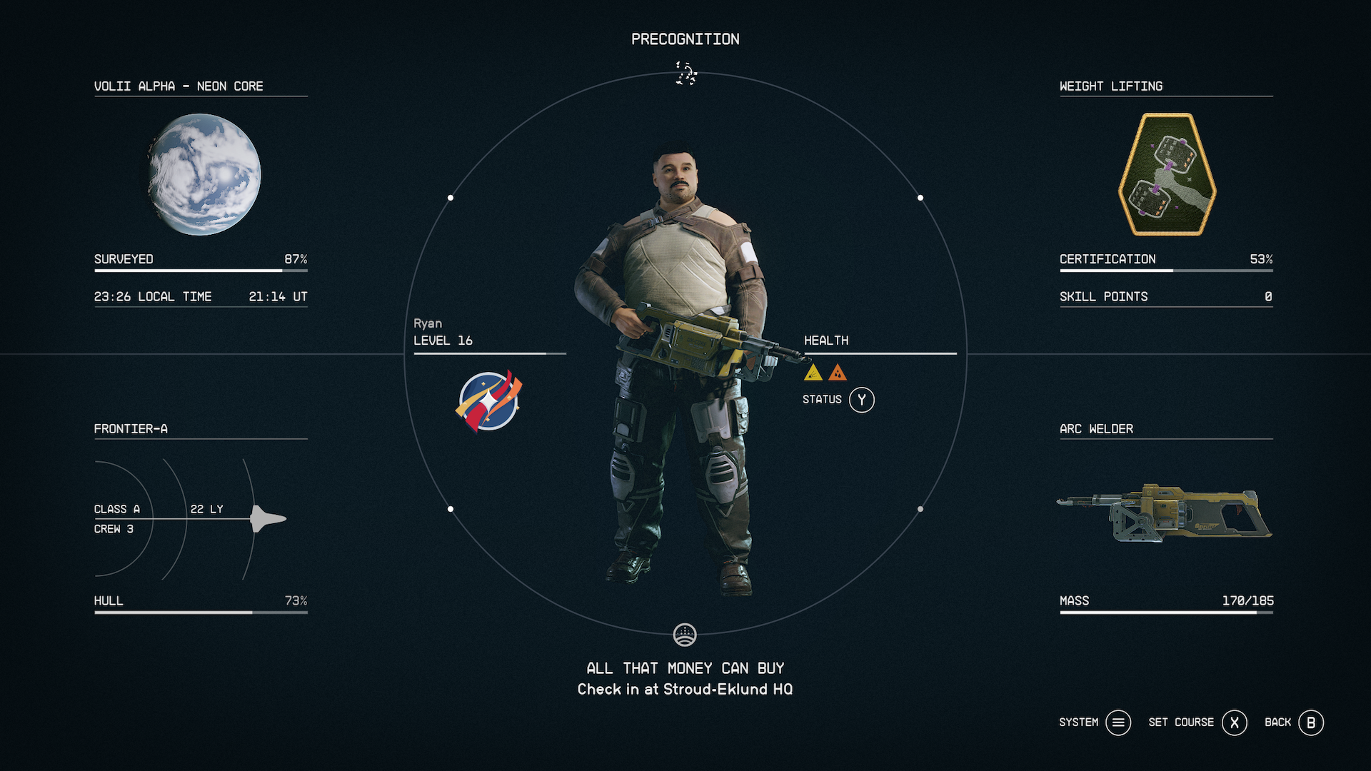
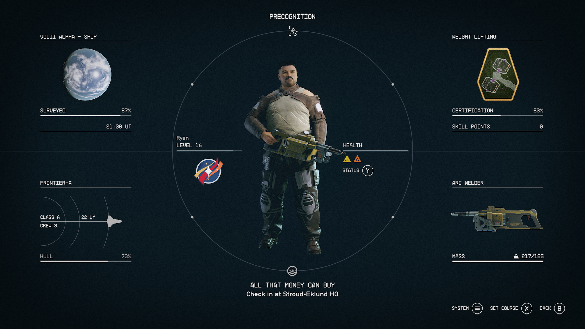
One of these characters is over-encumbered. Can you tell which at a glance?
The larger problem is that solving encumbrance lacks any efficiency. The game doesn’t give the user shortcuts to dump items in bulk, or even recommends candidates to jettison. The single sort option also forces the user to assess inventory weight separate from value, or other properties. So there’s no easy answer as to what should be dropped at a glance without digging into every category of stuff you have.
Solving inventory transfer doesn’t have to be painful. Transferring items to a companion requires a sluggish stumble through Starfield’s dialogue options, when it could simply be a menu option (similar to buying and selling at vendors in the game). Getting inventory to your ship, requires the user to pass through a loading screen and board their vessel, where again, through vendors there’s no location (or distance from ship) requirements. Allowing users to transfer to their ship or companion, just by being in proximity to them could help mitigate this. These don’t strike me as any more immersion breaking than hearing repeated dialogue or waiting through a loading screen to board your ship.
Form over function
This is a tough one. For all of my gripes with the experience of using Starfield’s menus, I think the game’s art direction and overall UI aesthetic is pleasing, and cohesive. Starfied’s art director Istvan Pely described the look as “NASA Punk.” Which I’m way into. Though in reality, one principle that anyone would strive to achieve when designing an interface for someone in space would want to achieve is life-and-death usability. You can’t confuse a trained astronaut who might be in the middle of an extreme emergency.
Starfield’s menus look attractive, but are often labeless cacophony of options that don’t explain what’s possible to the user
Now, the stakes are astronomically (see what I did there?) lower for playing a video game, but menu after menu seems to trade form over function. The main “pause” screen is the most basic example. At a glance it’s clean, bold, and neatly organized, but it’s usefulness is severely limited, and important details about the users status, equipment, and goals are all obfuscated behind their respective menus. There is also poor visual hierarchy — The focal point is the user's character, arguably the least useful information for decision making and task completion.
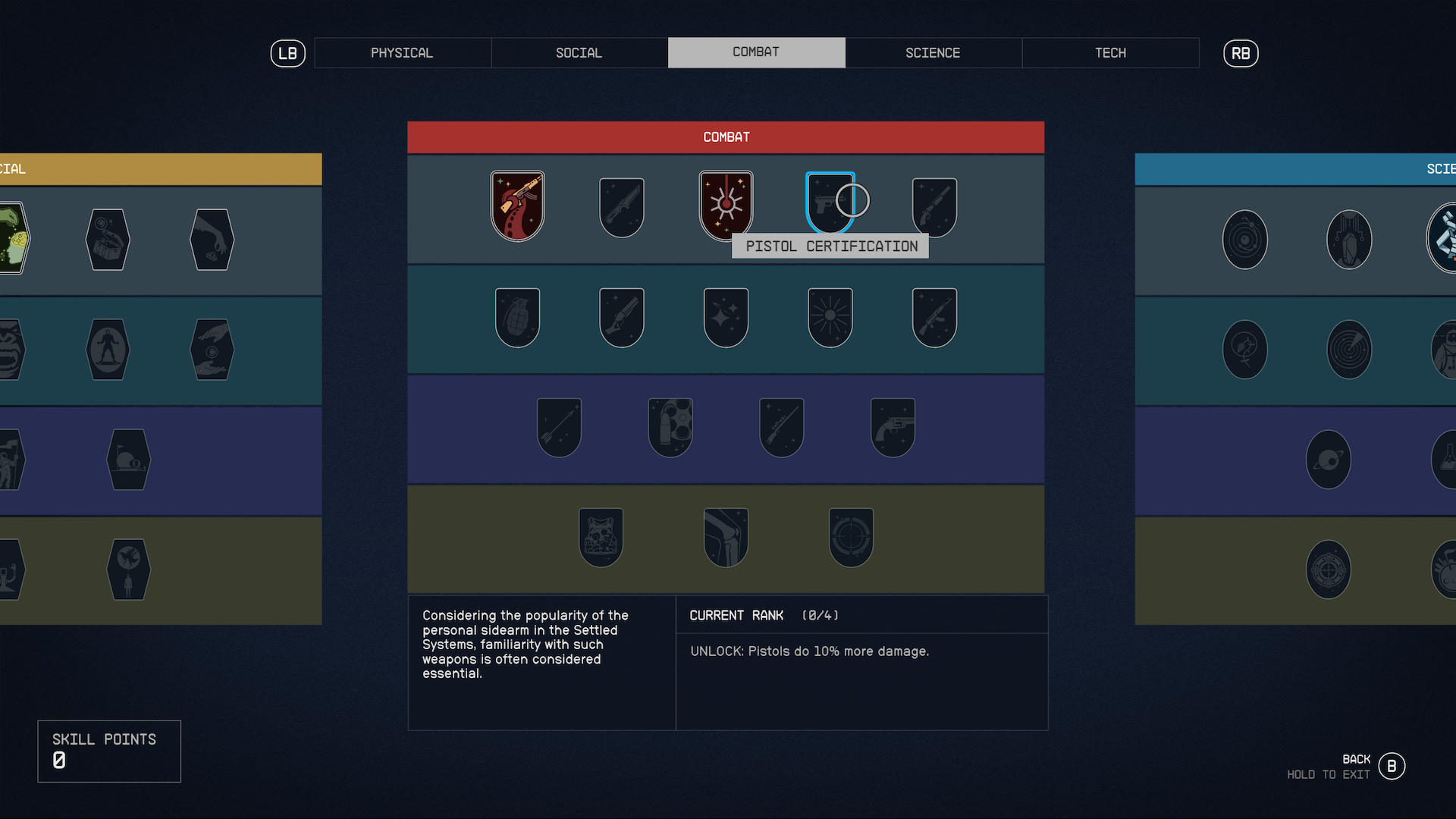
The skill point menu is colorful and iconic, but it’s bereft of labels without hovering on options, and has no clear indication of progress tracking beyond a “shine” animation for badges.
The inventory menu trades valuable interface real estate for showing off in-game assets, which is visually striking and made to appreciate details on items. It undermines itself when I can’t understand an item's value, usefulness, or relationship to other items.
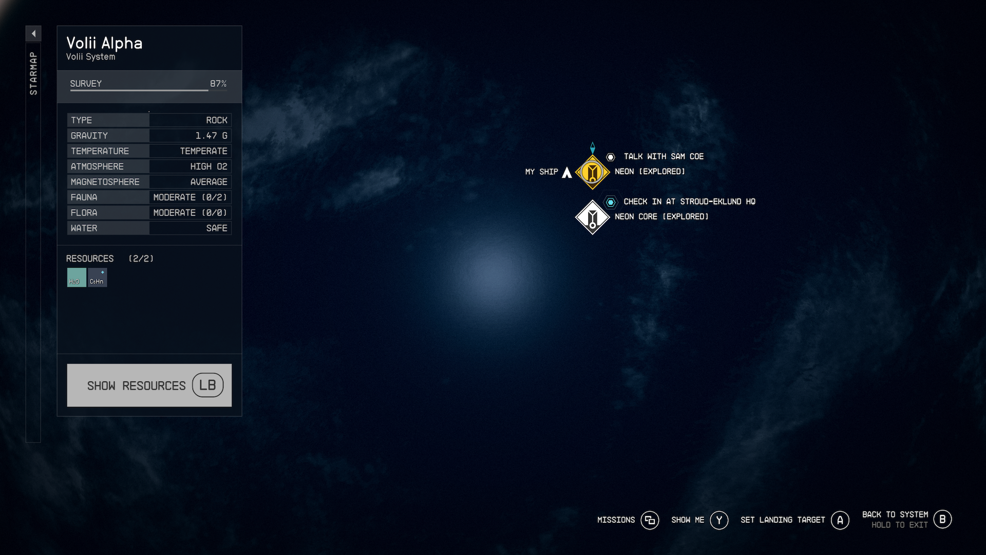
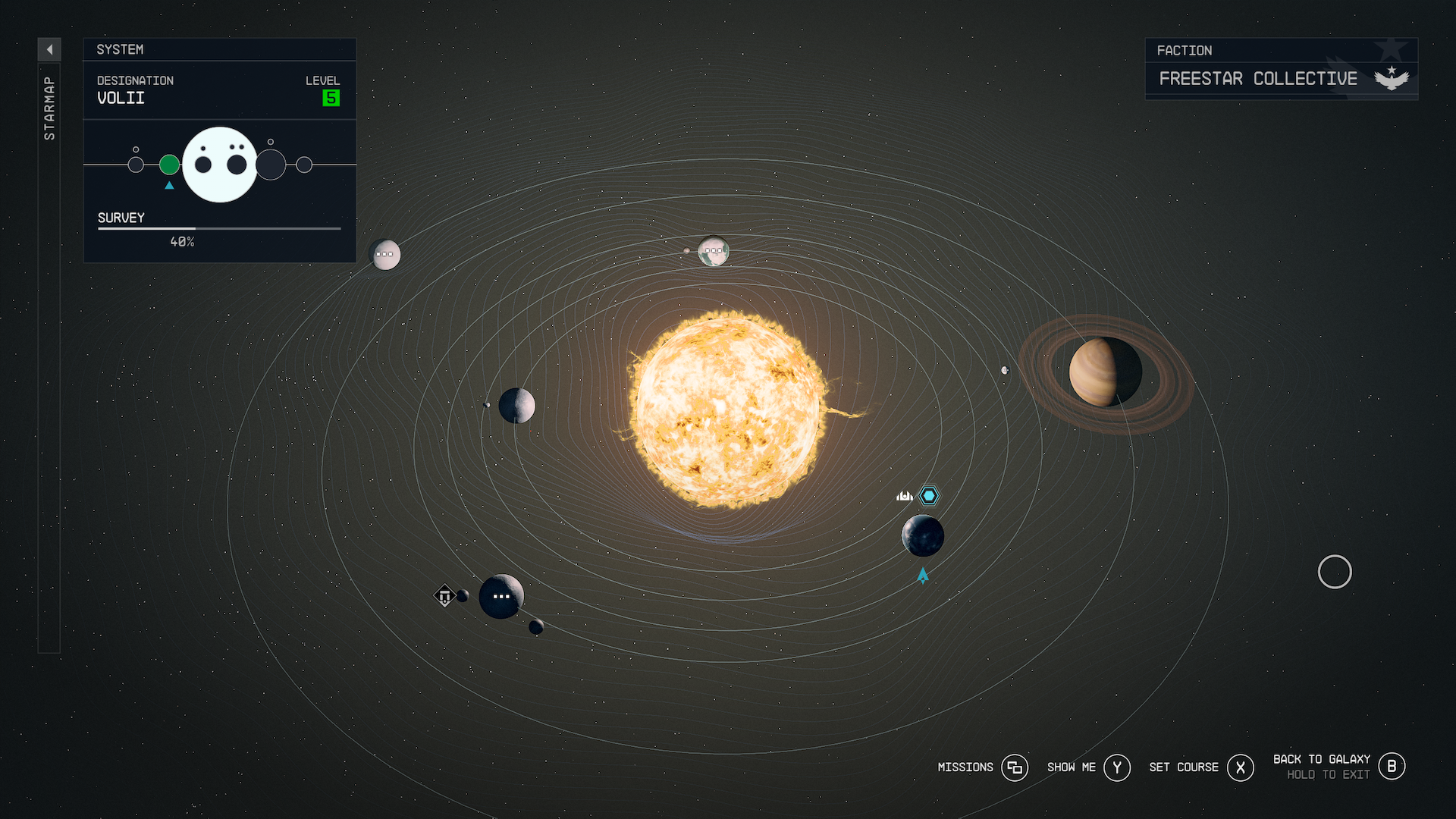
The on-foot map provides insufficient data to navigate a user to important markers, while the galactic map is more of a toy-interface than a way to navigate around. While impressive visually, the user is left with tiny, indescribable icons floating around small floating spheres on their screen that is so slow, most activities rely on the user leveraging a “go to there” shortcut to avoid having to interact with the map.
The favorites menu depicts items as silhouettes, but the inventory system doesn’t ever associate a silhouette with a weapon.
The menu for the spoilery-thing (the stuff you find after a while in the main story) is nonsense, with completely meaningless glyphs and poor organization and context.
The ship builder is like Fight Club… We don’t talk about the ship builder.

Repair (2) what?
Perhaps the greatest indication of aesthetics winning over usability in Starfield is the overall lack of consistency in its user interface. It may be a conscious choice by Bethesda to make each of these menus so unique from each other, since games often trade on aesthetics for the sake of immersion. But each menu almost feels designed by different teams, at different stages of development, and all chasing the goal of making navigating lists of options prettier, not easier. A well designed interface uses each element and pattern to teach the user patterns of interaction that can be extended and mastered, making using something faster and easier with repetition. Starfield’s interface feels like work every single time.
One way to improve the balance between usability and aesthetics would be to build in more shortcuts for task completion. If a user is encumbered, when they pause, present options for ditching or transfering items. If a character or ship is low on health, give the user a shortcut to the right aid to remedy their affliction. If when you’re building a ship, it has a problematic part, take the user there so they can remove or swap it out.
Quality of life
My last critique category comes in the form of feedback users have expressed about the games mechanics, graphics, and structure. Simply put, user interface and user experience in games has progressed quite a bit over the last decade, and Starfield doesn’t feel like it’s benefitted from the industry’s collective learning. Here are some examples:
Users cannot mark items as “junk”, and take fast bulk actions on junk
You can’t use/consume aid items from the world immediately, you have to pick them up to use them
The gear system lacks an expressive number or indication of value
The game doesn’t do much to protect the user from selling or dropping important items
The interface doesn’t speed up or rearrange unexplored dialogue options
There isn’t much in the way of accessibility options for controlling cursor speeds, font sizes. or colorblind options.
If you don’t buy back items from a vendor in the same conversation, you lose them
The “New items” option is unpredictable and inconsistent
The game doesn’t dynamically switch between your space suit and clothing depending on your location, or have an option for that.
The game shows you item values that don’t seem to match when speaking to vendors
The game doesn't auto-equip throwable when you run out of a particular
The experience of tracking more than one mission is unclear/poor
All of your equipment and weapons have to be assigned to the same favorites menu.
No on-screen HUD track missions or skills.
I’m sure there’s plenty more that users could rattle off without much effort. All of these things and more amount to time saved, and rough edges smoothed over. Still, the fact that there are more to add is an indication of the weakness of this game’s interface.

Forget horse armor, I’d pay for a “mark as junk”
Trading scope for usability
There’s so much I love about Starfield, and the fact that it exists feels literally awesome in and of itself. Making a game at this scope is hard, but for what I personally value in my gaming experiences, I would trade addressing the issues I’ve outlined above over a lot of the scope of this game. That’s not to say that this is the right choice for everyone, but it definitely is for me. I assume that there are many factors I haven’t considered, as my forte is mostly outside the realm of interactive entertainment, but our world is filled with software, and it still creates expectations that inform how we interact with video games.
The one thing that concerns me most, is that it’s hard to say whether or not any of these things will be added or changed by Bethesda. They’re not well known for revisiting or fundamentally revamping their big single-player games. Plus any down-the-line changes can’t give back the hours of frustration that users are feeling now. Yes, there are modders who will flock to fill in these gaps, and there are users for which these things won’t overshadow the accomplishments of this game, but I wish the studio who prides itself on sweating the small stuff spent more resources on what it means to craft an interface that connects all of this huge scope together.